Media & Techniques
A Better Approach to Color Theory, Part 2 (Ep. 113)
After talking last week about how and why we teach color, Maggie Maggio is back for the second part of her conversation with Tim. They dive even deeper into the topic, covering the best resources to teach color theory (6:00), why kids should learn both additive and subtractive color mixing (10:15), and how we can work together to promote color literacy (21:45). Full episode transcript below.
Resources and Links
- Part 1 of the Podcast
- Kolormondo, the ultimate color tool
- Tim’s article on Kolormondo
- More AOE color theory resources
- The Munsell Symposium Call for Artwork
- Munsell 2018 on Instagram
Transcript
Welcome to Art Ed Radio, the podcast for art teachers. This show was produced by The Art of Education, and I’m your host, Tim Bogatz.
We talked last week about color theory, and in a pretty in-depth way. Maggie Maggio was my guest, and the amount she knows about color theory is just staggering. We had an awesome discussion about systems of mixing color, ideas on color, how we can think of color and teach it in better ways, and quite a bit more.
In fact, that discussion literally wasn’t even the half of it. Maggie and I talked a lot longer than what you heard last week. So this week, we’re going to continue that conversation. You’re going to hear part two of our talk on color. This one is longer, but it has a lot more hands-on ideas. How the art of science and color come together, why color is the perfect STEAM project, and we’re also going to talk about other apps and ideas for how we can bring a better understanding of color into our classroom.
And more importantly, we cover a lot of ideas on how to do a better job of teaching color. Some creative, some novel ideas. New apps, new strategies, and just a plethora of approaches that I think are worth your time. And part two is a long one here, so I think we’re going to go ahead and get to it. Here’s Maggie Maggio and me talking about better ways to teach color in your classroom.
Tim: Maggie, if I can ask you this, I know when teachers are getting really in-depth on color theory, it’s usually a good mix of both the science and the art of color theory. So can color be taught as a STEAM unit?
Maggie: Ah, great question. Yes. Color, of course, it’s the perfect STEAM unit. STEAM is about adding art, which is often considered conceptual and intuitive as a subject, to science, tech, engineering, and math, which are often considered to be more analytical, logical. They’re very objective. They’re all about measuring. We sometimes refer to these two ways of thinking as two sides of the brain, the left and right sides, but that’s really not the reality. Everyone has a little bit of both, the left and right side. They might prefer one or the other, but we’re all constantly moving between those two sides of the brain.
Research lately has said that it’s the ability to cross back and forth that leads to creative and innovative thinking, so STEAM … The guys at STEM realized they were kind of one-sided, and we really want to have the art included. So STEAM then, for me, is you can bring art into science classrooms, and you can bring science into art classrooms.
Betty Edwards, author of Drawing on Both Sides of the Brain, also wrote a book about color. She describes the process of learning about color as this constant toggling between the two sides of the brain. So again, it’s this being able to both think about what’s not working when you’re kind of painting and the colors aren’t quite right. You have to then analyze it, and that’s a skill. You can then learn that skill. And then you can go back to the right side and be very expressive, and go back and forth and build that muscle that is the connecting muscle.
So absolutely, color is the perfect STEAM unit. I would . . .
Tim: Yeah, and … Go ahead, go ahead.
Maggie: In both science and art, you can exercise that connection between both sides of the brain, and because they’re both about exploration, you can treat all color theory as an experiment. What works, what doesn’t work? You can practice the scientific method anytime you’re working on color mixing. You can observe and record, and that can be great fun. That’s at all ages.
So here’s a list, a few ideas for including color science in an art classroom. You need to do it in age-appropriate ways, but some ideas are . . . just go ahead and bring some of the traditional science equipment into the classroom, art classroom. You’ve got prisms and microscopes, test tubes and pipettes. And just by virtue of seeing that equipment, kids can understand, this is about experimenting, doing explorations. You’ve got art materials that you can just play around with as if they’re in a science lab. So that’s one way.
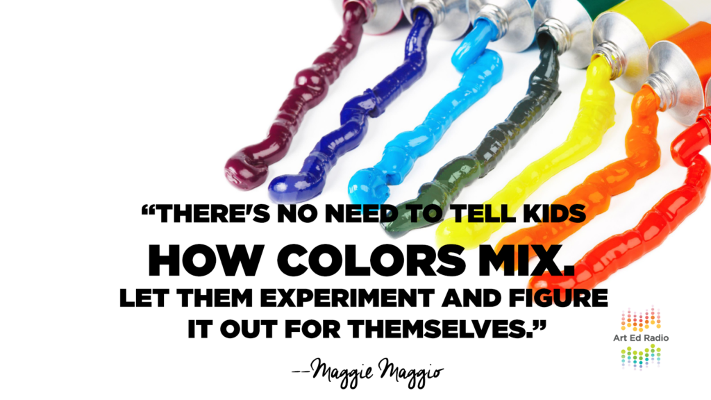
A real good example is just to compare, as an experiment, compare red-yellow-blue to cyan-magenta-yellow mixing. There’s no need to say one is better than the other. If the kids can experiment, they’ll actually see what the results are. They can make their own conclusions. You can make a whole bunch of samples. All the way along, kids can be taking notes. They can be learning how color is mixed with this firsthand experience, and just by writing it all out and keeping track of things, even by creating their own names for colors as they go, that reinforces the experience of doing the color mixing.
It’s a much more hands-on and a much more process-based way to do it than just sitting down and making the same old color wheel every time.
Tim: Yeah, exactly.
Maggie: And then the science of color, the light mixing, using LEDs. There’s fun experiments out there with little LED light bulbs hooked to little bits of batteries, and you can play there. I do have, on my website, I do have a few tools that are actually available for light mixing. The Optical Society of America has put out a really good color mixing and light set, and also the PASCO company has a color mixer. Unfortunately, they’re rather expensive to have in the classroom, but maybe a school could have them. They could be used in the science classroom when they talk about color in the science classroom. They could be used in the art classroom to look at color mixing and light.
There are just a couple different ways there. With all the kids having access to iPads and computers, at the point you’re going to learn digital color, you can start using all kinds of apps and ways to play with color mixing and light on a computer. There’s a bunch of new affordable color measurement tools that are used … It used to be, a spectrophotometer was thousands and thousands of dollars, and now you can buy, for less than $100, you can buy some of these color samplers that will tell you what the color equals in CMY and also in RGB. And that might be a fun way to play.
One of my favorite things to do, though, is to explore color value, because it’s a really difficult concept to understand, that a blue that’s tinted out to be light blue could still be darker than a yellow that has been shaded. So a dark yellow that’s often going to be lighter than the light blue. How does that work? Well, you can play with that by having a whole lot of samples. Paint out a lot of swatches, and then organize them into how light or dark they are by their value onto poster boards, and the fun way to do that sometimes is just to turn all the lights off, and then you’ll see if the colors are in the right value poster or not, because the light ones will pop out from the dark ones.
Tim: Yeah, I think that’s a great list, and I think teachers will appreciate just having all of those new ideas. But one thing that you mentioned in there that I kind of wanted to talk more about was light mixing, because I know just so many teachers talk about subtractive color theory, just dealing with paint, dealing with print. But not nearly as many teachers actually work with their kids on additive color theory, the science of it dealing with light, doing digital work.
So, I guess, could you explain the difference between additive and subtractive? Like, how and why the two differ, and I guess maybe give us your opinion on why you think kids should learn about both?
Maggie:: Okay, well, let’s start with why kids should learn about both. We are moving into … We’ve already moved into a digital world, and as art teachers, you want to give them the opportunity to be as expressive as they can in any media, and the digital media is fast becoming a new art form. And not just doing graphic design using a computer, but playing with LEDs and lighting as an art form. There are light fairs all over the world now where artists are showing up and projecting light as their art form.
So let’s assume that kids should now learn about both light mixing and color mixing in paint, and now we’ll talk about the difference between the two and a way to wrap your head around how it works. So additive color mixing is about light. When you color mix in light, when you put all three primaries together, the red, green, and blue primaries of light on the computer, you add up to white light. So color mixing in additive light means we just add up to white light.
Subtractive and paint, every time you put colors together, you subtract out light. So if you imagine putting, say, even just a green and a blue together, you’re going to get a darker blue-green. It will never get lighter. It will always go a little bit darker. And if you put all three primaries together, you’ve taken all the light away and you’ve subtracted out to black.
So that’s the definition of the two. But the reality is, we’re not talking two different systems. We’re talking one system that is moving in two different directions. If we go back to this idea of a 3-D color model, something like Kolormondo, I can take you on two journeys, but in that one world, that one world of color.
So let’s start with a subtractive journey. Let’s do it as if we’re working in paint. When you’re working in paint, you’re going to be working with a set of primaries. Traditionally, red-yellow-blue. Ideally, now, if we’re going to make this 3-D world of color work, we want to start with cyan-magenta-yellow. Either way, we can make it work.
If you start, say, mixing primary colors in that, in paint, as you mix two colors together, you’re going to get a secondary. That secondary is not on the same, say, color wheel as your two primaries were. It’s not on the equator. Those two colors are going to mix to make a secondary that’s a little bit darker, and then if you add the third primary, you’ve moved all the way down into black at the south pole.
So two move it slightly down, three move it all the way down. That moving all the way down to black is the reason why any time you put a third primary into a color mix, you get muddy and you get dark. So that’s the same as adding a complement to a color, right? Because if you have a single primary and you add the opposite to it, you’ve added basically the other two primaries. So every time you put a little bit of a third primary into subtractive mixing, you go dark and all the way into muddy. So you can walk colors around the globe in this sense of always going darker when you mix colors together.
But what if you want to go lighter? In subtractive mixing, you have to basically thin your colors out. And you can thin them out by, in watercolor, doing a wash. And the white of the paper shows through, and now you’re moving up into light. Or you can move up into light by adding white, which is kind of the more common, traditional way to do it. But what you’ve done, by adding white, is you’ve thinned out the amount of color you have. And now you’re moving up to light. So you bring back the light by putting in some white or thinning it out. So you’ve just traveled up toward lighter colors.
Now, did that make sense as a journey through the color world from a subtractive perspective?
Tim: Yes, absolutely. Absolutely.
Maggie: Well, what’s funny is that you do exactly the opposite journey when you’re working in light. So in light, you’ve got three primaries. You’ve got the red, green, and blue. And if you combine two of those together, you will get a secondary that is moving up toward light. Cyan-magenta-yellow, if you look at a color picker on a computer and just back off and blur your eyes a little, you will see that there’s these bright lines where cyan, magenta, and yellow are on the computer screen. And that’s because the secondary version of cyan, magenta, and yellow, have moved up toward light. So they’re going to be brighter and lighter. They are also not on the same equator as the red, green, and blue. They’ve moved up. They are now lighter.
So every secondary is moved up a little bit lighter, but if you add the third primary, you’ve got white. So you’ve moved all the way up now to the top, to the north pole. So red, green, and blue at 100%, or on a computer, 255, 255, and 255, will be white. So if you mix … So going back, if you mix, say, a blue and a green on the computer, you’re going to get a cyan. That cyan is going to have moved up toward light. If you’ve got your cyan, that means you’ve got blue and green. The opposite will be red. If you add a little red to a cyan, it will get lighter and lighter.
So in subtractive, when you add the complement, it will get darker and darker. In additive system, when you add the complement, it will get lighter and lighter. When we’re used to thinking in paint, this can be really confusing, but in reality, when you think about it, it’s just two systems opposite each other. In light, we’re moving up into white every time we combine colors.
But let’s do that journey now with light to get darker. How do you make light darker? Well, you have to thin the amount of, again, right. And if you thin the colors, little by little, you say, on a computer, the figures are 255, 255, and 255 is all light. If you start reducing those, you’re reducing the amount of light, you’re going all the way back down. You’re bringing those colors back down and getting closer and closer to black, so you don’t have very much light anymore. And now you have black. So we’re down to 0, 0, 0. And, yeah.
But both systems exist in that three dimensional model, and it’s just a matter of the journey that you’re taking. And you can be crossing paths as you go, so the same color lives in both.
Tim: Right.
Maggie: So anyway, that’s the two ways to look at that three dimensional model.
Tim: No, I think that’s a great explanation, and I think that something that teachers can use and that kids can understand. So I think that will be really helpful. But if we can just kind of continue on, just thinking about how we can approach this in the classroom, I guess. Let me ask you this. What are some of your favorite ways to teach color theory in a hands-on way? Everybody loves paint and color mixing, of course. A lot of teachers love to do Play-Doh or clay. I have a couple apps that I really like when it’s time to bring in some technology. But what are some of your favorite tools for teaching color theory?
Maggie: Well, I think the best thing, of course, is just to allow kids to play and explore, and we have ways to do that now where we didn’t in the past. They’ve always had ways to play with color mixing and paint and explore that way, and finger paint from the time they’re in preschool. But what they don’t have so much is ways to play with light, and so if you can add any of those tools that let them play with light, that’s one way.
I like to use an app called Color Savvy in the classroom. It’s a light table app. It turns any iPad into a light table. It is also-
Tim: Ooh.
Maggie: Yeah. It is also set up so that it allows you to change the color of that light table based on additive color mixing sliders, so you can actually change the color of that iPad screen by moving the full screen, which is really nice to have the full screen of the iPad. You can change the color by using these color sliders, so you can decide, that in itself is a game to play with the app. It’s just, what colors do you get when you move the sliders?
It has a couple extra sliders, the alpha slider and the brightness slider, but you can ignore those. Those three sliders – the RGB – allow you to make the color table anything you want, so that’s all about playing with additive. But if you add theater gels or cellophane film that you’ve laminated and cut into shapes, the kids can use those laminated theater gel pieces on top of the light table, and that’s the equivalent of mixing colors in paint. So it’s subtractive color mixing. Theater gel on top of a theater gel will subtract light.
So now you’ve got a chance to play with both light mixing and the equivalent of paint mixing using the theater gels right there on the iPad. And you can go back and forth, and then reality is, you just kind of put that out there, and the kids get to … They’ll actually teach you how to use it, or how to play with color.
Tim: Yeah.
Maggie: And it’s an interesting way to have it all together in one spot. Light mixing, or call it additive mixing and subtractive mixing, they’re in one spot. And so that’s just … Step away, let them play.
Tim: Yeah, yeah. That’s awesome. All right, so I think it’s probably time for us to finally wrap this up, but let me close with this question, ’cause I know you do so much as far as just thinking about the big picture with all of this. So how can we work together, everyone who has an interest in this, to promote color literacy and everything that goes with it in the 21st century?
Maggie: Yes, thank you. It is a bit of a passion of mine, as you can tell. I think what’s happening now is something that has never happened before, and that is, we have transformed into a very, very technological world, and it’s really important that, I think, that we start taking advantage of it. And color is pretty much at the heart of what everyone sees every day, and we kind of lose track of it, and take it for granted. And it is such a miracle that we can see color, that we can live in this color world, we can use it for expression.
And so absolutely we need to take advantage of the technology, and I would say the big push right now is this understanding of color in three dimensions, because once you understand it, it all of a sudden makes a huge amount of sense, where before it was frustrating and confusing, now it just … Yes, this is the reality of how color works, and now we are empowered to really go out there and be expressive with it.
So what has happened is that we, I think, are still stuck in a traditional way of teaching color that is very limiting, and we want to expand that. We don’t have to replace anything, we have to supplement. So if you can put CMY in the classroom and let kids play with it, that’s one way. If we can put a three-dimensional model as a hands-on way to understand this three dimensional way color works, that’s another way.
I think we are heading toward a change in the standard curriculum of how color’s taught. We’re not there yet. There’s a number of initiatives that are working on that. One of the problems is that if the standards say that red, yellow, blue are primary colors, and that’s all that is taught, that is not aligned with what is going on in science today. It’s not aligned with the reality of how color works. But it is entrenched and in place.
So, yeah. It’s a toughie. I think rather than call it a battle, I think we just … We don’t even go there. We just say, what we want to do is empower kids, so we do want to give them an experience that lets them understand color in new ways. That’s the bottom line for me. So everything’s about expansion and embracing this new world of color. And eventually, it’ll all work itself out.
So I’m on the board of the Inter-Society Color Council. It’s an organization for color professionals in all fields, across arts, science, and industry. And color education, color literacy, is one of the hot topics right now. And we couldn’t have done anything about it until now, so with iPads and LEDs and everything else, that’s going to make the change happen.
Tim: Yeah, that’s really cool. I like that a lot. So, awesome. I think that will be the best place for us to leave it, so Maggie, thank you so much for sharing all of your expertise with us, sharing your time with us. It has been great talking to you.
Maggie: Thank you so much, Tim.
Tim: All right, that will do it for us.
Now as we wrap things up here, just one more reminder for Maggie’s color symposium that is going on, and their call for artwork that I told you about last week. It’s called Celebrating Color, it is open to all ages and all media. The deadline is the end of the month, so there’s still time for your students or for you to enter. We will link to that call for artwork, and you can check out some of the submissions that they already have have on Instagram, @munsell2018.
I would definitely encourage you to check out that opportunity, like I said, either for yourself students or for yourself. Also make sure you visit artedradio.com to see the show notes for this week. Links for everything we mentioned in the last two weeks, there’s just so much that we covered. And I want to make sure that we have all the resources together for you in one place, and who knows? I may even put all of this into an article with just a ton of resources on teaching color. It’s something that I love, something that I always love to dive into like we have over the past couple weeks.
And I would love to just have a guide to everything that you need to improve your teaching when it comes to color theory, because if we’ve learned anything over this really long discussion over these past two weeks, it’s that we are just scratching the surface when it comes to how we teach about color.
Art Ed Radio is produced by The Art of Education with audio engineering from Michael Crocker. Next week, we have an awesome episode coming with Clara Lieu, who runs the amazing Art Prof website. You are going to love it, so make sure you tune in next Tuesday. We’ll talk to you then.
Magazine articles and podcasts are opinions of professional education contributors and do not necessarily represent the position of the Art of Education University (AOEU) or its academic offerings. Contributors use terms in the way they are most often talked about in the scope of their educational experiences.