Media & Techniques
A Better Approach to Color Theory – Part 1 (Ep. 112)
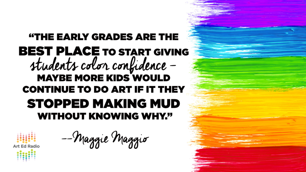
How long have you been teaching the dreaded Red-Yellow-Blue color wheel? Are you getting a little tired of your kids mixing colors that look like mud? Have you thought “there’s got to be a better way to do this”? Well, there is–and this episode is the right way to get started understanding and teaching color in a new way. In the first of a two-part episode, Maggie Maggio joins Tim to talk about why we should change our approach to teaching color (6:30), the shift from RYB to CMY (9:15), and why we need to be using a 3D model to help understand color (13:00). Full episode transcript below.
Resources and Links
- Kolormondo, the ultimate color tool
- Tim’s article on Kolormondo
- More AOE color theory resources can be found here
- The Munsell Symposium Call for Artwork
- Munsell 2018 on Instagram
Transcript
Welcome to Art Ed Radio, the podcast for art teachers. This show is produced by The Art of Education, and I’m your host, Tim Bogatz.
Now a couple weeks ago I was in Seattle for the NAEA national conference, and I don’t want to talk about it too much because if you were there, you were there, and if you weren’t, you probably don’t want to hear too much about it. But I will tell you that it was a pretty good time and I love a lot of the experiences that we all have when we go to conferences, whether that’s state, national you know, even just local things that you may be doing. Any time you can get together with other art teachers, it’s a wonderful thing.
It’s something that I talked about with Debbie West a few weeks ago on the podcast, the importance of making those professional connections. And made a new connection that I’m pretty excited about, it’s Maggie Maggio, and she knows more about color than honestly pretty much anybody I’ve ever met, and you’ll hear the interview today.
But let me back up just a little bit before we dive in here. Because a few years ago when I was just a writer for AOE … I mean it seems weird right, this is like pre-podcast days, no videos, no grad courses, I was just writing articles. But I was able to write one about Kolormondo’s color globes. And if you haven’t checked out Kolormondo before, you absolutely should. They make these incredible globes that are the best visual I’ve seen that demonstrates color in three dimensions. Kids can put them together and they show hue, value and chrome like all in a globe. It’s super cool.
I don’t want to get into the weeds too much here, but I’ll just say that I was able to write an article that was called A Revolutionary Tool For Teaching Color. So feel free to check that out or check out the Kolormondo website to see what that’s all about.
Anyway I’m telling you that because, when I was in Seattle, I stopped by the Kolormondo booth to see what was up with them, to say hello to Nicoleen from Kolormondo, who I worked with for that article, see what’s new with them. Nicoleen introduced me to Maggie, and we hit it off immediately.
Maggie and I have just the shared love of all things color obviously, and we had some really good conversations about how we teach it, what we could be doing differently, and how we can get teachers to kind of go beyond just that basic idea of mixing red, yellow and blue.
So she agreed to come on the podcast and, what’s kind of unique about this is that, we talk for so long but we’re actually going to split it into two different podcasts. So you’ll hear the first part of it today, and then we’ll do the second part of the interview next week.
So if you love color theory and everything related to teaching color, you’re going to love the next two weeks. And if not, I don’t know, you can check back at the end of April I guess.
But, before we get to it, I want to tell you about a couple more awesome color resources from AOE that are worth your time to check out. They’re both learning packs from the Art Ed PRO library.
First one is diving deep in a color theory, which is with Johanna Russell. She has so many great ideas about teaching color theory, and practical application in the classroom. It also has 12 or 13 different downloads that you are absolutely going to love and use when you’re teaching colors theorem.
The second learning pack is from friend of the pod Andrea Slusarski and it’s called Exploring Color Theory Through Watercolor, which is kind of an interesting, kind of a cool way to do it. That one has 20 videos, 10 downloads and Slu takes you through basic techniques, advanced ideas and everything in between. Plus, she gives you some awesome lessons that are ready for your classroom right now.
So check out both of those learning packs at the artofed.com/pro, and if you haven’t signed up yet, go get started on your 30 day free trial. You’re going to love it. Again, that’s theartofed.com/pro.
Alright, I’ve been talking long enough and you probably need to hear another voice so let me play the first par of the interview with Maggie. And Maggie Maggio is joining me now, Maggie how are you?
Maggie: Oh I’m fine Tim, thanks for asking. It’s exciting to be talking to you.
Tim: Oh awesome, I am excited to have you, I’m excited to kind of dive in to color theory and I guess how we teach color theory. Let’s just kind of start with a quick introduction. So can you talk about how you got started with teaching color, why you’re so passionate now about teaching color and I guess some of the things that you’re particularly interested in at the moment?
Maggie: Oh yes sure Tim thanks. I started teaching color workshops about 25 years ago to adult artists. Mostly I wanted to share what I was learning about color mixing. At the time, mixing was still a mystery to me and learning how to actually get the colors I wanted was something that I felt came out of the old red, yellow blue tradition, and wasn’t working.
So I started to look at what was called the double primary system and all these other ways to mix colors. I discovered I could make a red from a yellow and a magenta. That set off a whole series of questions in my head about what is it that we’ve learned about color, what is right and what is wrong, what works and what doesn’t work.
I started using just the cyan, magenta, yellow and that was when the aha moment came and I started to teach adult artists. Why am I passionate about it? It’s because well, it works, number one. And number two is that I kept hearing from my adult students their level of frustration with color mixing and then taking the class, and they would come out of it and say, “You know this works so much better, why did we learn about red, yellow, blue in grade school?” And my answer was usually “Well, that’s the traditional way to teach it, this is what we’ve known for a long time, we didn’t have the products up until recently to do the cyan, magenta, and yellow mixing. It comes out of photography, it comes out of printing.” And yes they’re still learning it school.
25 years ago, there was no way to introduce it. There were no student grade products available. So I’d explain that there are reasons why it’s still being taught, it can’t change yet.
So why am I passionate now? I’m passionate because now there are the products available. We have started this revolution already with printing, so it’s time. We can make this transition now, and we can make it so that color mixing is not frustrating for anyone. Not for the teachers, not for the students. So this is why I get very excited about making that change.
Tim: Yeah that makes a lot of sense, and I think the place to start is with teachers, because like you said, there’s so much frustration out there when kids are mixing so many different colors that just aren’t what they want it, it becomes so frustrating for them. And, I think there are a lot more avenues out there.
So, I guess can we talk a little bit about how … We teach theory like as our teachers … How we do this because … for me personally, I used to think that red, yellow blue is fine for our youngest kids and then as we get a little more advanced, we make that shift to working with cyan, magenta, yellow. And now I guess I’m kind of thinking that everybody should be doing CMY, but you talk a little bit about your views, about the traditional ways that we teach color theory, and maybe a little bit about how and why things can shift or why they should shift in what we’re doing in the classroom?
Maggie: Sure Tim. I’ve spent quite a bit of time over the last few years looking at how we are teaching children about color. It has become rather formalized over the years, and it starts with learning your color names, you do that maybe even before preschool. There are four things that all the kids are supposed to know before they go to school. They’re supposed to know how to count. They learn their numbers. They learn the alphabet. That’s going to be for math literacy, that’s going to be for language literacy.
They need to know these core concepts, then we add knowing the colors and shapes. Knowing the names of colors, knowing the names of shapes. That’s for visual literacy. That’s going to help them explain the world to themselves and to everyone else. It’s a way to look and see.
So in the very beginning, they’re learning color names, and they’re learning these basic colors terms that we all kind of learned, the black and white and the red and the yellow the green the blue the rainbow colors. What they’re not learning are these names that have to do with what I call 21st-century color. They’re not learning cyan, they’re not learning magenta.
That’s one of those basic color naming pieces that could change and maybe should change at some point. But it’s a real toughie because what does cyan look like, really? We’re starting to learn it because of the printers, we’re beginning to see cyan or cyan blue as somewhere between turquoise and ultramarine. We’re beginning to understand magenta as a color that’s … Yes it’s pink, it’s purple but it’s its own thing. It’s magenta.
That’s kind of the beginning of it. That teaching of color comes before kids even get into school. So then as an art teacher, that’s that’s what you’re given. You’re given this basic understanding of color naming, and you put out in the classroom these colors for kids to play with, and at some point, then the next step is you start teaching color mixing. The idea that one color can go with another color to make a third color.
And that’s where this institutionalized teaching of red, yellow, blue comes in. We say okay, the time we start teaching color mixing, we’re going to pull out red, yellow, blue, and I say let’s supplement that. You don’t have to replace it but supplement it with letting kids play with cyan, magenta, yellow. And they’ll get it. They’ll get that they’re getting colors that are really bright and beautiful.
So, that’s one step in the teaching of color. Another step is the teaching of color moving from dark to light. You always do this exercise where you pick one color and you mix it with some white, some black and hopefully with something in between, some gray. Each of those steps, I think, are presented pretty much by all teachers. Maybe even every year. Would you say that you have to do a refresher? Is that something you’ve done often?
Tim: Yeah, I think most teachers unfortunately go back to the color wheel over and over. They go back to their value scales over and over ’cause for whatever reason it’s something that just doesn’t stick with kids.
Maggie: Yeah. So there are two things that I want to say right here, and that is, yes, here it is as a lesson that we’re preparing and giving to the kids almost every year and yet it doesn’t work–at least this idea of red, yellow blue doesn’t work. No wonder they feel like they have their hands tied behind their back and maybe they don’t like art, this idea doesn’t work. And yet “boom”, they get so little art and what we give them is something that doesn’t work.
So, that makes no sense first of all. So that’s one good reason to bring cyan and magenta into the classroom. Also, the second point is when you limit it to this series of, first you learn the names, then you learn color mixing using some primary colors, and then you learn the tints, shades, and tones, what you haven’t done is you haven’t put it into a framework that makes sense to the kids. Something that’s sticky, as you call it, and what’s sticky, is if you start to see it in three dimensions.
So, we talk about how we’re teaching. One of the big things, and we’ve had this conversation before is, one of the big things is to start thinking of it always as this three dimensional model.
Tim: Yeah, okay. Sorry to interrupt you here but I think this would be a good start … When you and I talked, you had this … I mean I don’t want to hype it up too much but this kind of magical explanation of how color comes in 3D. So, can you talk or kind of share that explanation of how people can visualize color in three dimensions, like if you look at it like a globe? What does that look like to organize and kind of give a system to all of that color?
Maggie: Great. So, it’s not a new concept. The idea of seeing color in three dimensions is centuries old, but it’s not something we’re really familiar with. Sometimes you do see it in a book, Kolormondo is a system that we saw when we were up in Seattle at the National Education Association conference.
So, the 3D system is this … I’m going to go through a visualization that actually comes out of Munsell, Albert Munsell, and that is to think of color as a globe. Every classroom used to have a globe, I don’t know if they still do. But if Color is a globe, then the North Pole would represent white, and the South Pole would represent black, and the axis that runs between the North Pole and the South Pole going through the center of the earth represents the sequence of grays, or neutral colors that go from the dark to the light.
So there, between the dark and the light, are all those neutral colors. They’re running down the center. And then around the equator, around the middle of the globe, is that band of colors that represent the hues that we think of as the rainbow colors. We want to expand the rainbow to include magenta, so we have all these colors, red, yellow, blue coming around the Equator.
If you start looking at it that way, you can see that if we’re going to move colors, we’re going to move colors in three directions. We’re going to move say a red color up toward white, and that’s going to get tinted out, it’s going to get lighter and lighter. We can take a red and we can move it down toward the dark, and it’s going to get progressively darker. And we can take a color, the red, and move it in toward that center gray color and it’s going to get progressively less and less bright until it’s become very muted and almost neutral.
Every color moves in those three directions and that’s the typical tint, shade and tone exercise that you do in a classroom. So if you think of that exercise as being that slice through the globe, every color has that slice that goes through the globe. Build it all together, and you’ve got the full three dimensions of color. Did that make sense?
Tim: That does make sense to me, I’m hoping it makes sense to our listeners too, but I think it’s a great explanation. No I think it’s a great way to visualize things, and also I wrote an article about Kolormondo that you mentioned a couple years back, which is a great way to visualize this to allow kids to visualize that so, we’ll link to that in the podcast notes, everybody can kind of check that out a little bit more.
I actually want to go back to something you talked about previously which was, how we need to supplement what we’re teaching with colors theory. It’s not just about mixing colors, because color theory goes beyond mixing colors. There’s a lot more that kids can learn and so, can you talk a little bit about what that looks like and maybe can you speak to what you see coming on the horizon, like what’s out there in the future when it comes to teaching color theory?
Maggie: Absolutely. Well, if we look at those steps, they would be supplementing what’s in the classroom so that students can explore, experiment with cyan, magenta and yellow, and then the second step is to shift to something that’s 3D so that you can actually see colors in relationship to each other. I would say that’s getting close to the cutting edge. I would call it building a strong foundation based on this three-dimensional image of color so that everything you teach about color theory is somehow connected to this three-dimensional model.
And what I mean by that is the scaffolding of education. So if you start with the 3D model, every time you present a color theory lesson, you can relate it to the model. So for example, if you want to talk about value contrast and how important value contrast is to the legibility, being able to read a piece of artwork, you can go to this three-dimensional model and say look, here we have it, we have dark to light.
How can you tell what the value contrast is? We can find where the color lives in the color model and say yes, we’ve got enough value contrast. We kind of mislead students when we say that all the pure colors live in the same place, in a color model around the equator, but they really don’t. There’s actually this concept of a tilted equator. That means, if you push that equator so yellow moves up toward white, and blue moves down toward dark, now we understand that all those pure colors have a different value, and by value I mean, how much light is reflected by the color.
So that’s one area. And then another area is the concept of warm and cool. If you’re going to teach the concept of warm and cool colors, that has to do with the fact that some colors are visually stronger than others. Warm colors are visually stronger, cool colors are a little bit weaker. And so you can show that oh, we’ve got the warm colors over here, they’re going to push. And you’ve got the cool colors over here and they’re going to fade into the background.
That is a lesson that is a more advanced kind of color theory, and it’s scaffolded as you go through. You present each of these theories in a series from foundational to advanced.
Tim: Alright, I think that’s a good stopping point right there, a good break in the interview. As I told you earlier, we’ll run the second part of the interview with Maggie next week.
Now, in the meantime, I have something else that I want you to check out. Maggie is part of the Intersociety Color Council which is just this huge group that is dedicated to color and teaching about color. They have an entire symposium called the Munsell Centennial Color Symposium coming up in June. It honors Albert Munsell who Maggie referenced earlier. I will link it in the show notes, but you can find all of the information and a really cool website for the symposium at munsell2018.org.
As part of their conference, as part of their symposium, they have a call for artwork that is open right now. It’s called Celebrating Color, and it is open to all ages and all media. Now the deadline is the end of the month here, at the end of April, April 30th, so there’s plenty of time for your students or for you to still enter.
I know she would love to see what you’re doing. We’ll also link to that call for artwork, and you can check out some of the submissions on Instagram at Munsell 2018. It’s an opportunity that I would definitely encourage you to check out. I guess either for your students or for yourself.
I think that is it for this week, we’ll be back next week with part two of the interview and we will talk to you then.
Art Ed Radio was produced by the art of education with audio engineering from Michael Crocker. Keep exploring color theory, we have podcasts, articles, links in the show notes, pro learning packs, everything you need. So keep yourself busy for the next few days and we will wrap up this topic next Tuesday. We’ll see you then.
Magazine articles and podcasts are opinions of professional education contributors and do not necessarily represent the position of the Art of Education University (AOEU) or its academic offerings. Contributors use terms in the way they are most often talked about in the scope of their educational experiences.